01
How to Future-Proof a Stately Home
25 November 2020
How to future-proof a stately home written by Marc Allen
 How to Future-Proof a Stately Home

Museum websites represent a significant portion of the heritage sector, and it’s important to examine the current landscape to identify which elements are working exceptionally well for these institutions. In my research, I’ve analysed a vast number of museum websites, selecting the finest examples based on a range of factors. These examples, presented in no specific order, showcase outstanding museum websites that excel in various aspects such as aesthetics, usability, and innovative features. I trust that you’ll find the following examples both inspiring and informative, offering valuable insights into what makes a museum website truly exceptional.
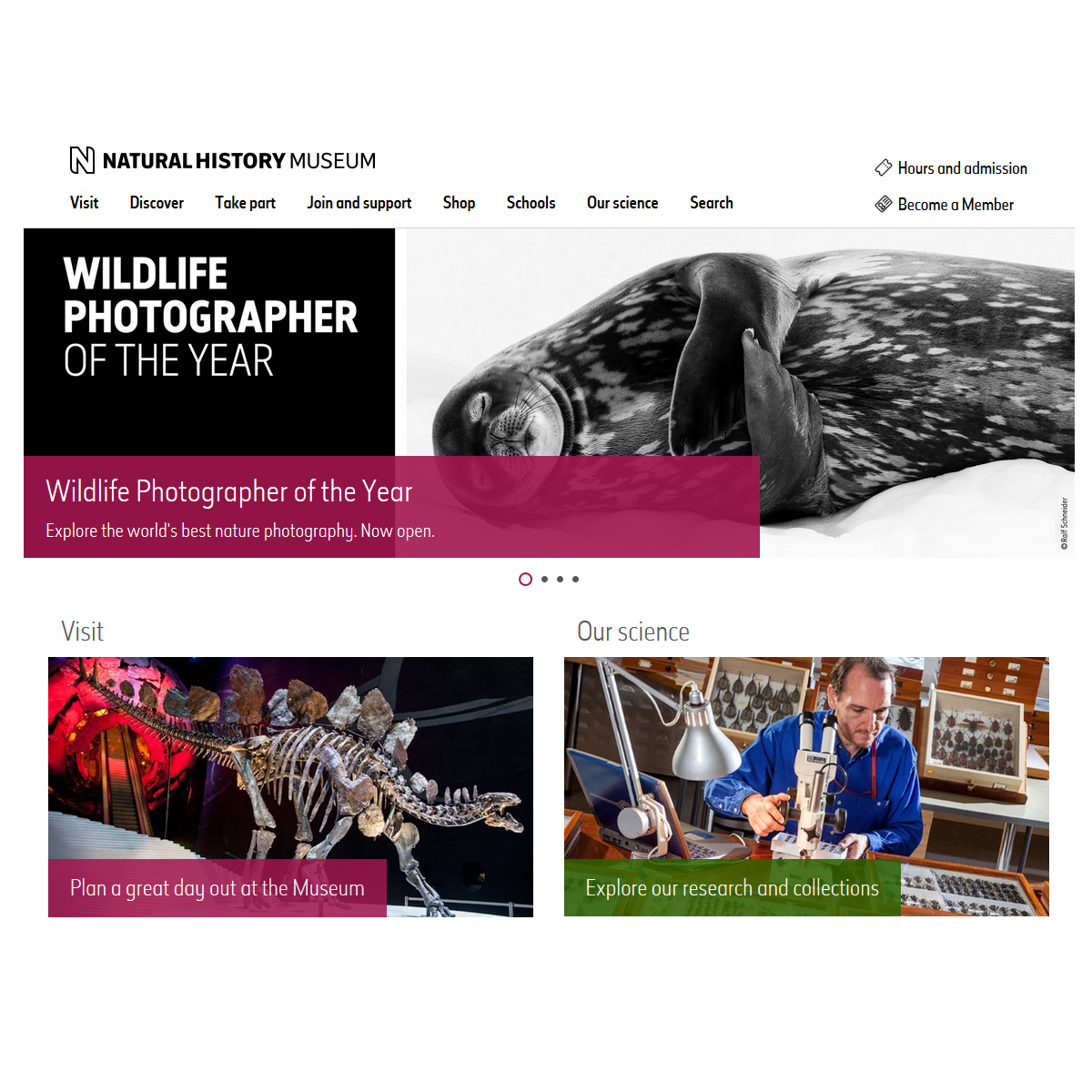
This is a wonderfully clean and useful site focused on communicating to its audience. The imagery is striking and does most of the talking. The navigation is particularly simple and easy to use, whilst containing links to so many pages. I feel more than anything that this museum website has perfected to fine balance between keeping it simple to use whilst still looking visually interesting and engaging.
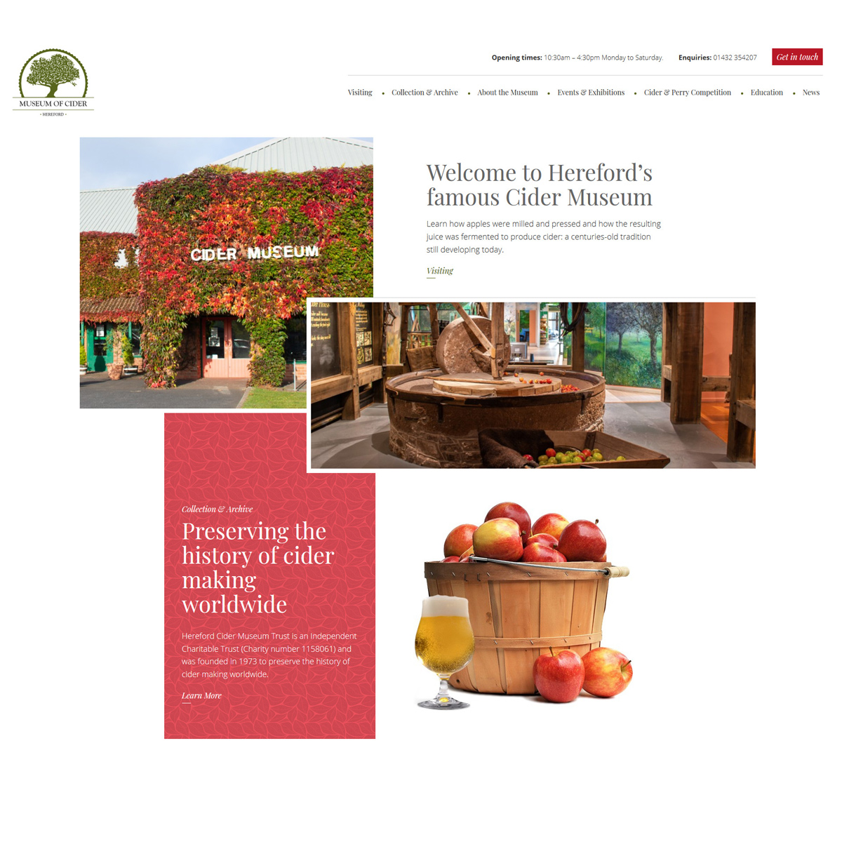
This is a museum website we were commissioned to create and although we are clearly biased, I hope you will agree it is a visually stunning and very easy to use website. The site has some very pleasing, but not over the top animation effects that keep the user engaged whilst browsing. The site also utilises AJAX loading which essentially means as you navigate between pages it is done smoothly without page reload. I also know first hand that behind the scenes there is a powerful but incredibly easy to use Content Management system that was tailored specifically for this specialist museum.

https://www.brooklandsmuseum.com/
The Brooklands Museum immediately caught my attention as a motorsport and aviation enthusiast. The homepage provides an excellent introduction to the museum, with a masthead image carousel that effectively communicates its character.
As you scroll down the page, you’ll find informative and engaging content, including an eye-catching video showcasing various vehicles that immediately captures your attention.
The website’s design is tasteful and elegant, with a conservative yet well-executed style. The colours are expertly coordinated, complementing each other perfectly to create a cohesive and harmonious visual experience. The overlapping elements and high-quality photography further enhance the site’s visual appeal.
Overall, the Brooklands Museum’s website is an excellent example of user-centric design that caters to the needs of its target audience. It effectively combines form and function to deliver a standout experience for anyone interested in this fascinating field.
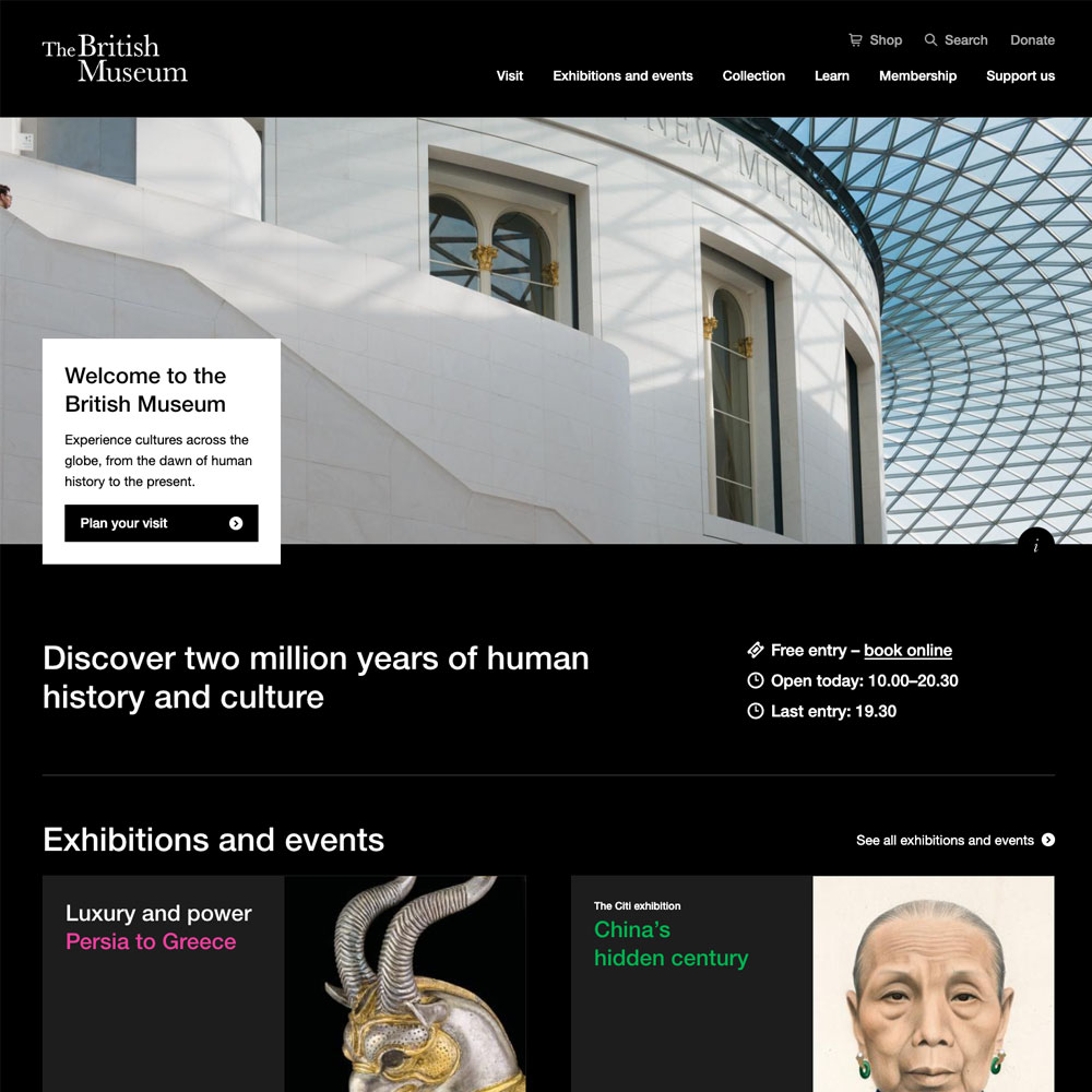
https://www.britishmuseum.org/
The British Museum’s website features a unique and modern approach to its design that sets it apart from other museum websites. The black background paired with large, bold typography gives the website a sleek and sophisticated appearance, while the use of neon-like colours such as pink and green creates a high-contrast and eye-catching effect that draws the viewer’s attention.
The mega-menu navigation and various hover states add to the modern look and feel, giving users a seamless browsing experience. Furthermore, the subtle movement on the collection cards further down the homepage provides a sense of personality to the website, making it more engaging and enjoyable to browse.
All of these features combined create a visually appealing website but also make it easy to navigate and use. These features also contribute to the website’s longevity, ensuring it remains relevant and attractive to users for years to come. Overall, the British Museum’s website is an excellent source of inspiration for anyone looking to create a modern and visually pleasing museum website.
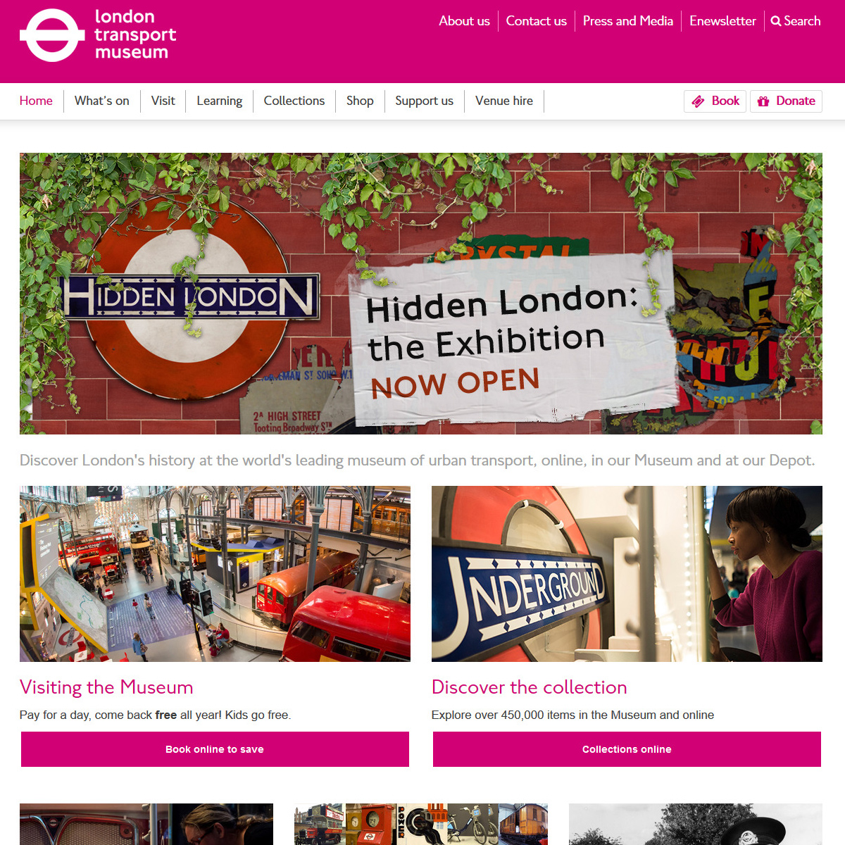
I think probably what I like most about this site is simply the bold and colourful layout which mirrors the classic design of the London Underground Map. Like the London Underground Map itself, the website reflects function over aesthetics and has an incredibly clear and easy to use navigation. This site is a great example of how important it is to have a clear understanding of the overall brand strategy of a museum or heritage organisation.
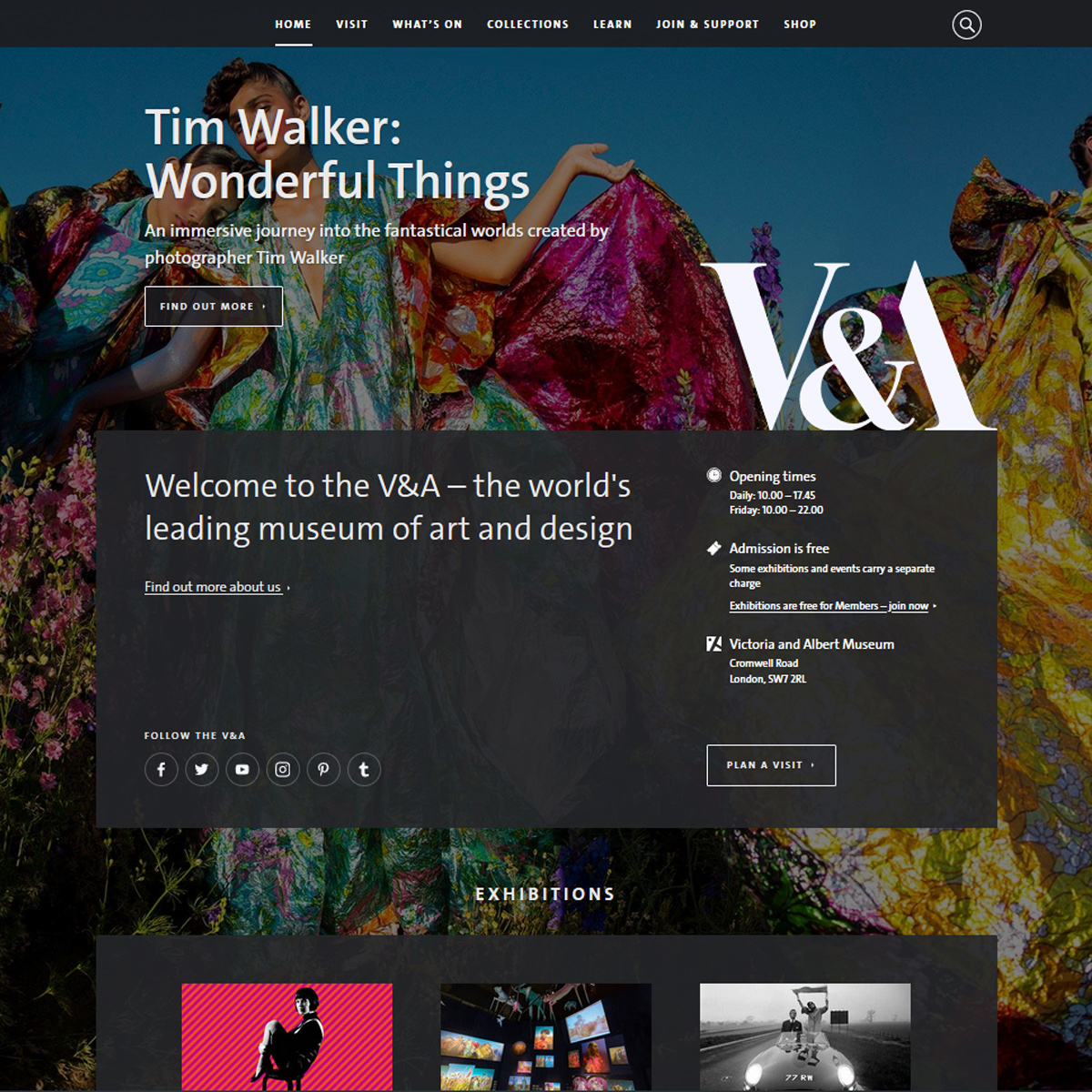
This is a behemoth of a website with a budget and resources to suit, which is no surprise considering the V&A is the World’s leading museum of art and design. I love the overall look and feel of this site, and although generally I’m not a fan of static background images whilst you scroll, it somehow works really well here. Each page has a different background giving a uniqueness to the user journey that keeps you exploring throughout the site.
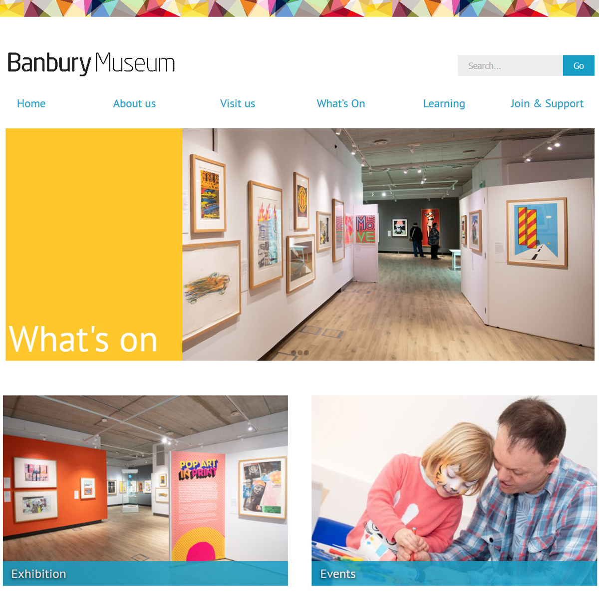
I just love the light and colourful playfulness of this website which stands out as one of the best museum websites examples out there. This is further helped by visually striking imagery, a common theme in my list here, and an easy way to make a good website look even better. As one of the smaller museums on this list, it stands out as one whereby the website is, to use an old pugilism term, punching above its weight.
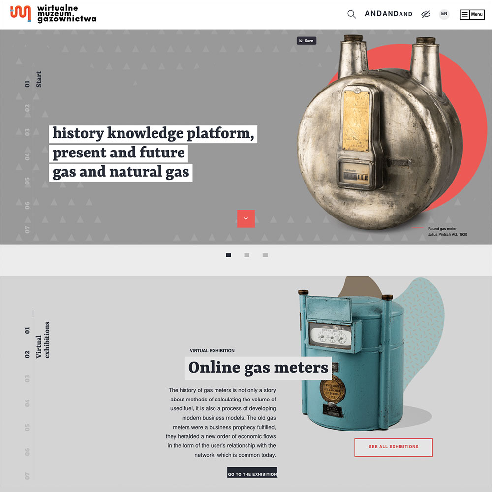
Wirtualne Muzeum Gazownictwa is an exceptional website that truly immerses its users in the fascinating history of the gas industry. The creators of this website have executed it with a level of creativity that is both engaging and informative.
One of the most impressive features of this website is its parallax scroll animation. As you navigate through the timeline of the gas industry, the parallax scroll animation creates a seamless transition between the different eras. It almost feels like you are taking a journey through time as you move from one section to the next.
The use of image cut-outs and patterns is also worth mentioning. These elements add a retro vibe to the website without becoming overly tacky. In fact, they add to the overall charm and nostalgia of the website. They are used in a way that is both visually appealing and informative.
Overall this thoughtful and engaging design is a valuable resource for those seeking inspiration and guidance in creating timelines that effectively capture the evolution of a subject or organisation.
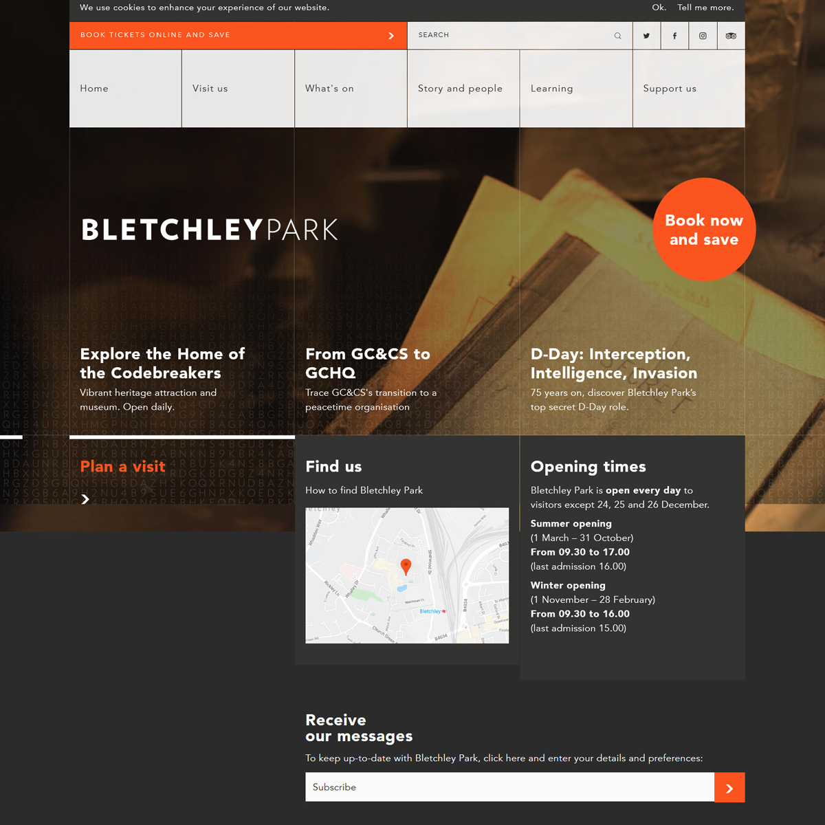
This site uses video in an effective and subtle way. We are massive advocates of video being used in this way and I think this is a rather good example. The site itself is rather simple, but has hints of complexity, a nod to the engineers and code breakers themselves. Looking at the navigation you might think the site consists of just a couple dozen pages, however the site contains over 1500 pages rich with content. The styling might not appeal to everyone, but I believe the site does a good job of talking to its audience.
https://www.sciencemuseum.org.uk
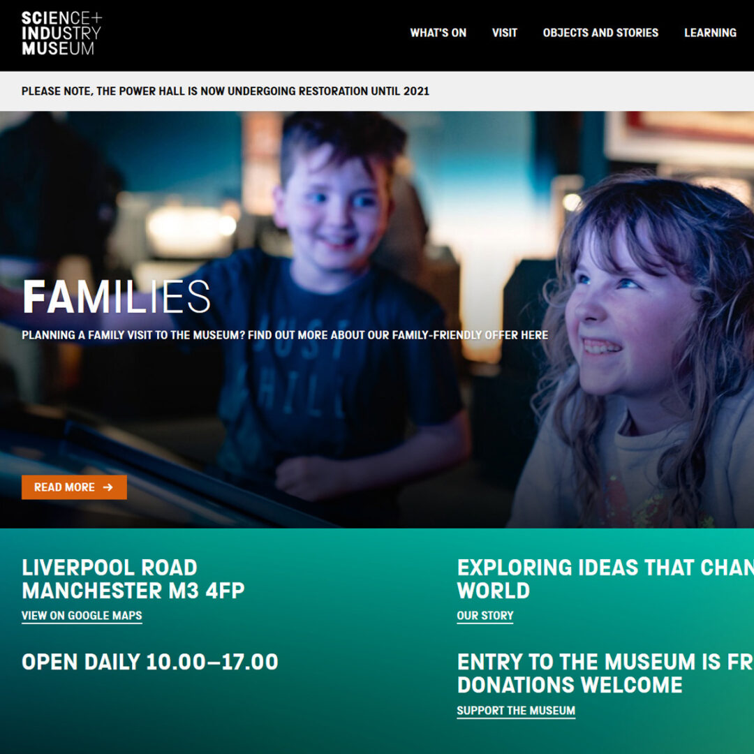
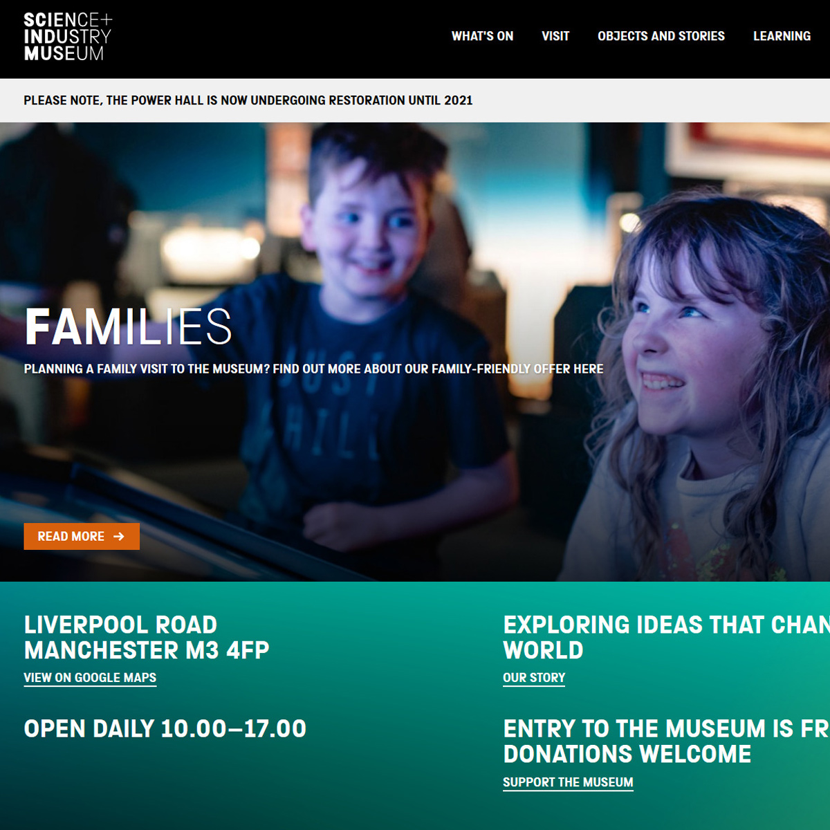
This is actually a group of museums, rather than one, and that’s why I like it so much. All of the museums use the same overall framework, but because the content is specific to each of them, there is a unique identity for each. The use of large and colourful photography helps further improve the aesthetics of this group of websites. Subtle gradients are used instead of flat blocks of colour, adding to a sense of depth. Rather interestingly, many pages are inverted with white text over dark backgrounds and this gives a sense of freshness when exploring different sections.
This concludes my list of some of my favourite museum websites. I hope you have enjoyed viewing them and would love to hear what sites stand out to you in particular. Feel free to drop me an email with your comments and start a conversation!
How to future-proof a stately home written by Marc Allen
How to Future-Proof a Stately Home
We are delighted to have been commissioned to design the new Humanist UK website which will be launched in the upcoming months.
 Humanists UK web design
Creating effective web design and digital strategies for visitor attractions: a look at heritage Creative’s approach and success stories.
 Web Design for Visitor Attractions
We are delighted to announce that Heritage Creative has been shortlisted in 3 categories in the Midlands Rural Business Awards 2019/20!
 Rural Business Awards Finalist