We all know colour can impact how we feel. Imagine walking into a room painted in deep reds and coal black, versus soft blues and neutrals. Chances are, you’ll feel calmer in the latter.
But how does this translate into the colour choices we make at museums and galleries?
Can colour really impact a decision to visit a space, to linger in an exhibition, and to return again in the future?
How does colour psychology work?
Colour psychology is not an exact science.
Yes, colour choice can affect our thoughts and mood, but this is all subjective. Reactions vary from culture to culture.
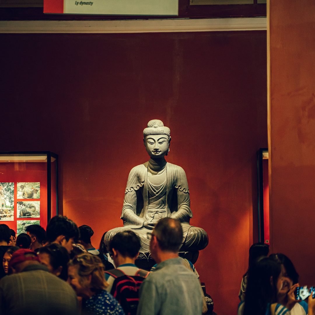
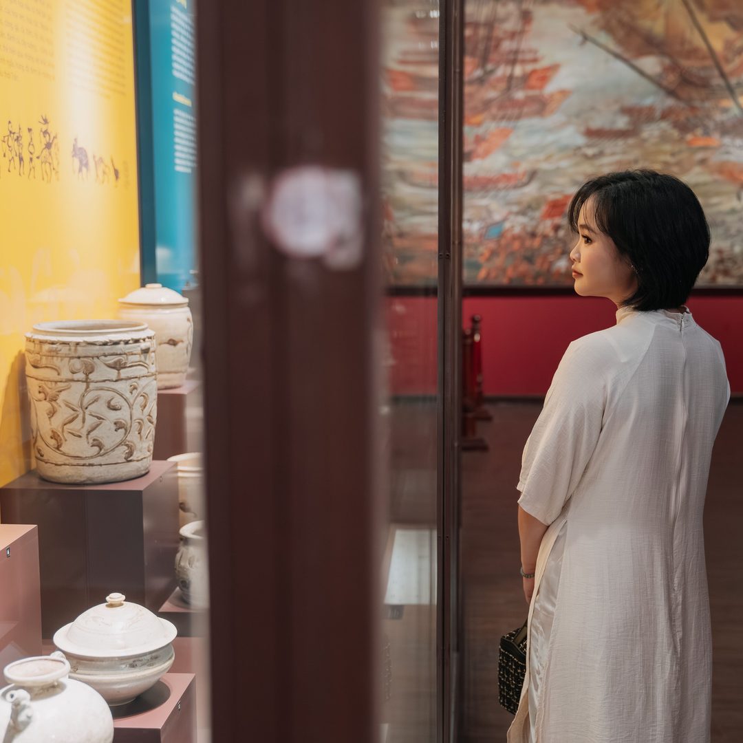
A great example of this is the colour red. In Europe and North America, red is linked to danger, passion, urgency. In many Asian cultures, however, it’s a symbol of luck, wealth, and fertility.
These reactions to colour can even differ from person to person, as our own deep associations play their part. How many people are decorating their bedroom in the same pastel pink of their long-term dentist, for instance?
Subjectivity aside, though, there are interesting points to consider around colour choice for your organisation and how it affects footfall. Some of these are about moods and associations linked to colour, and some are a little more black-and-white. Thoughts around accessibility, for instance.
Let’s split this into two sections to think about: the marketing side of your colour considerations; and the choices you make for your physical spaces once visitors are actually onsite.
Colours and marketing
When it comes to persuading visitors into your space to begin with, colour can play a huge part.
When people look at a product for the first time, up to 90% of their assessment of it is based on colour alone.1 Your product is your museum or gallery itself, including the marketing collateral you use to promote it.
It counts to get it right.
Harnessing your brand colours
One of the first things to think about is branding. Do you already have strong brand colours which you can pull into the marketing for an upcoming exhibition or event?
If you’re a well-established museum or gallery, using your brand colours can be a powerful tool. Audiences recognise that what you’re offering is legitimate and feel a sense of loyalty towards supporting your organisation.
Supposing you’ve built a good reputation, your brand colours remind potential visitors that you’re a trusted choice for a great day out.
And, if you’re only recently developing your brand, the best way to establish it is to use it!
Making use of a variety of colours
Brand colours might be great for day-to-day visitor footfall, but when you have something new and exciting going on – such as a big, one-off talk or a special exhibition – conveying this newness is just as important.
In this case, your branding should feature, but you might also use separate colours to highlight the novelty of the experience.
Here, it’s worth thinking about the feelings certain colours evoke. By triggering an emotional response, they can attract your target audience and help people decide whether what you’re offering is something they’d be interested in.
For example, your brand-new exhibition aimed at children could adopt yellows and oranges – colours we associate with youth and cheerfulness – or even pinks and purples, which bring to mind imagination, creativity, and playfulness.
Going for black – a colour linked to power, authority, and sophistication – could give the wrong message.
How colour encourages action
Once you’ve caught the attention of the right people, you want to make it as easy as possible for them to do what you want them to do, such as buying a ticket.
Choosing highly contrasting colours (those on opposite sides of the colour wheel) draws the eye, and is a great strategy to use for call-to-action buttons on your website. Brighter colours themselves tend to drive stronger click rates.
Be aware, though: using too many colours – especially bright ones – becomes distracting, and can disorientate your audience.
Making it straightforward for visitors to take the next step is what you’re going for here, and having all text in clear, contrasting colours is crucial for accessibility.
Colour in your museum or gallery
Many of these principles can be applied once visitors are actually onsite, too.
For instance, an exhibition which uses too many contrasting colours can be hard to process, because our brains reject information that’s overwhelming. On the other hand, information that’s visually dull can be harder to concentrate on.
It’s about striking the right balance.
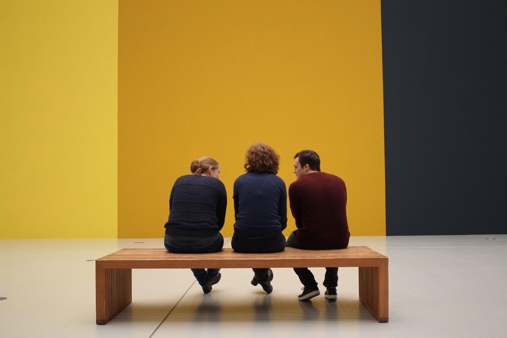
And don’t forget to make use of white space, too. This directs your audience’s attention towards the most important text or artefacts, helping them to focus on it without distractions.
Colour and storytelling
Of course, because of its emotional value, colour can also be used to bolster the storytelling aspect of your exhibition, contributing to the overall experience and the likelihood that your visitors will return.
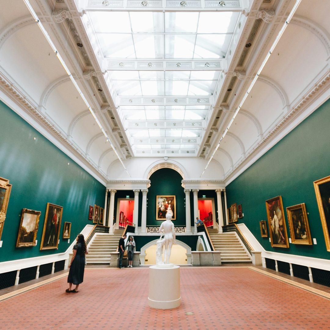
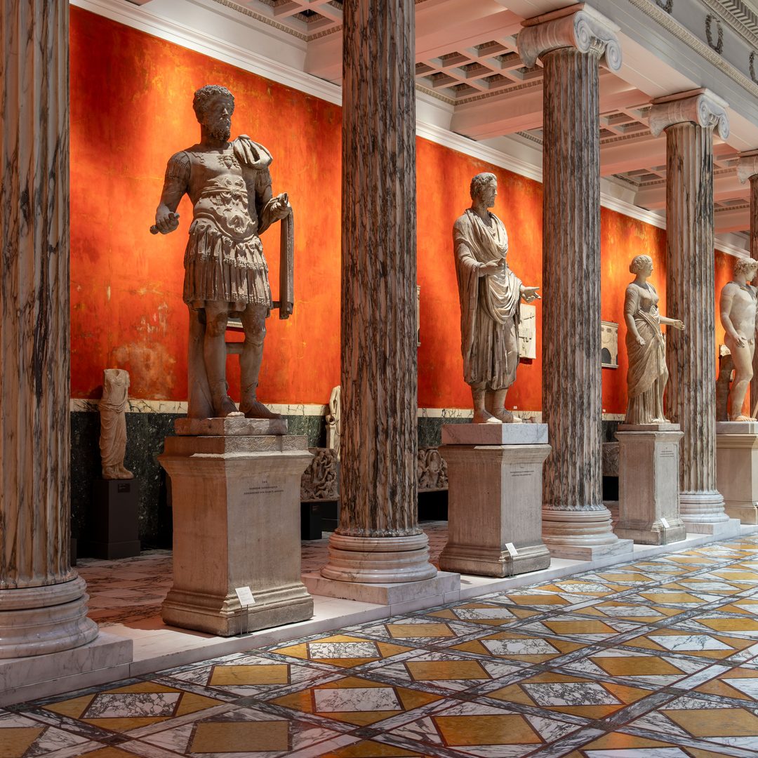
Muted tones convey a sense of gravity, for example. You might consider these for an exhibition about war. Warm colours (such as reds, oranges, and pinks) suggest energy and passion, while cool colours (like blues and greens) reflect tranquillity and freshness.
This can be taken at face value.
An exhibition about the climate emergency, for instance, could be designed in reds and oranges. Not only would this convey the idea of a literally warming climate, but the use of red lends urgency to your message.
Colours and pacing
That sense of urgency can be harnessed in other ways, too.
Energetic colours, like those reds and oranges, encourage people to pick up the pace, and could be useful in exhibitions where a lot of ground needs to be covered. Conversely, softer, cooler colours encourage people to linger and absorb detailed information that might require a little more time to read.
Through colour, then, you may be able to influence the flow of visitors through your spaces.
That brings us full circle back to branding. Using your brand colours in your physical spaces creates a feeling of cohesion, cementing your reputation and identity in your audience’s minds.
In turn, this makes the response to your brand colours stronger the next time it comes to marketing an event, and visitors may feel more inclined to come back in the future.
1 Singh S (2006), “Impact of color on marketing”. Management Decision, Vol. 44 No. 6 pp. 783–789, doi: https://doi.org/10.1108/00251740610673332
Written by:
Connie Rout
other insights
01
Up Your Digital Game in Downtime
04 April 2021
Up Your Digital Game in Downtime This current downtime can be used as breathing space to take a critical review of your on-line presence.
To provide the best experiences, we use technologies like cookies to store and/or access device information. Consenting to these technologies will allow us to process data such as browsing behavior or unique IDs on this site. Not consenting or withdrawing consent, may adversely affect certain features and functions.
Functional
Always active
The technical storage or access is strictly necessary for the legitimate purpose of enabling the use of a specific service explicitly requested by the subscriber or user, or for the sole purpose of carrying out the transmission of a communication over an electronic communications network.
Preferences
The technical storage or access is necessary for the legitimate purpose of storing preferences that are not requested by the subscriber or user.
Statistics
The technical storage or access that is used exclusively for statistical purposes.The technical storage or access that is used exclusively for anonymous statistical purposes. Without a subpoena, voluntary compliance on the part of your Internet Service Provider, or additional records from a third party, information stored or retrieved for this purpose alone cannot usually be used to identify you.
Marketing
The technical storage or access is required to create user profiles to send advertising, or to track the user on a website or across several websites for similar marketing purposes.

 Up Your Digital Game in Downtime